Precision is much more useful when it can be repeated.
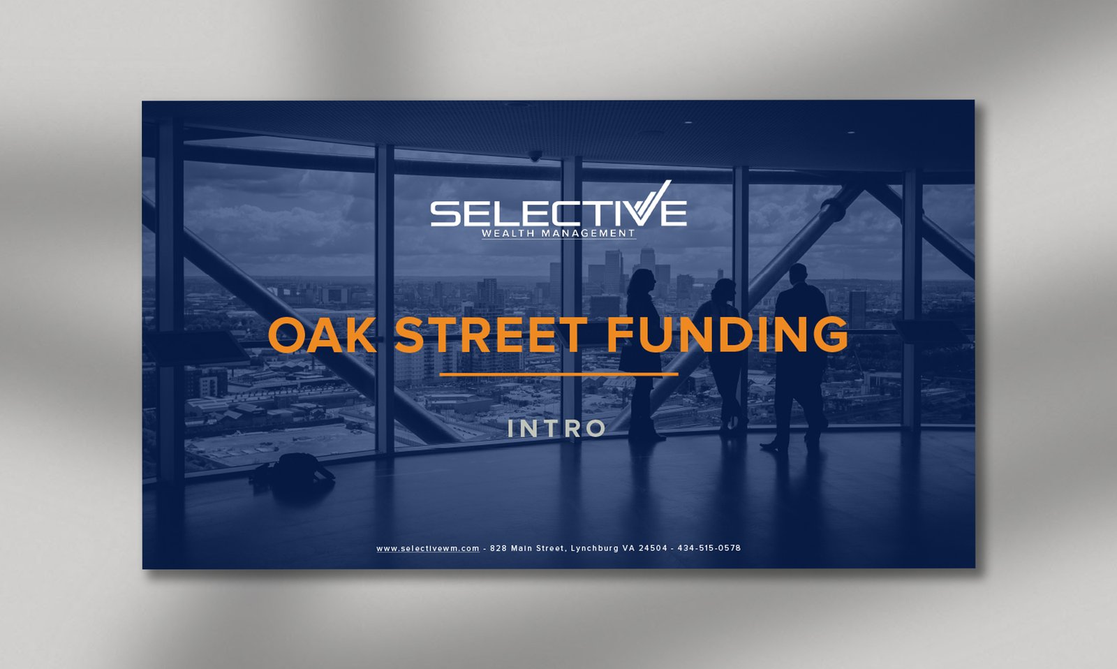
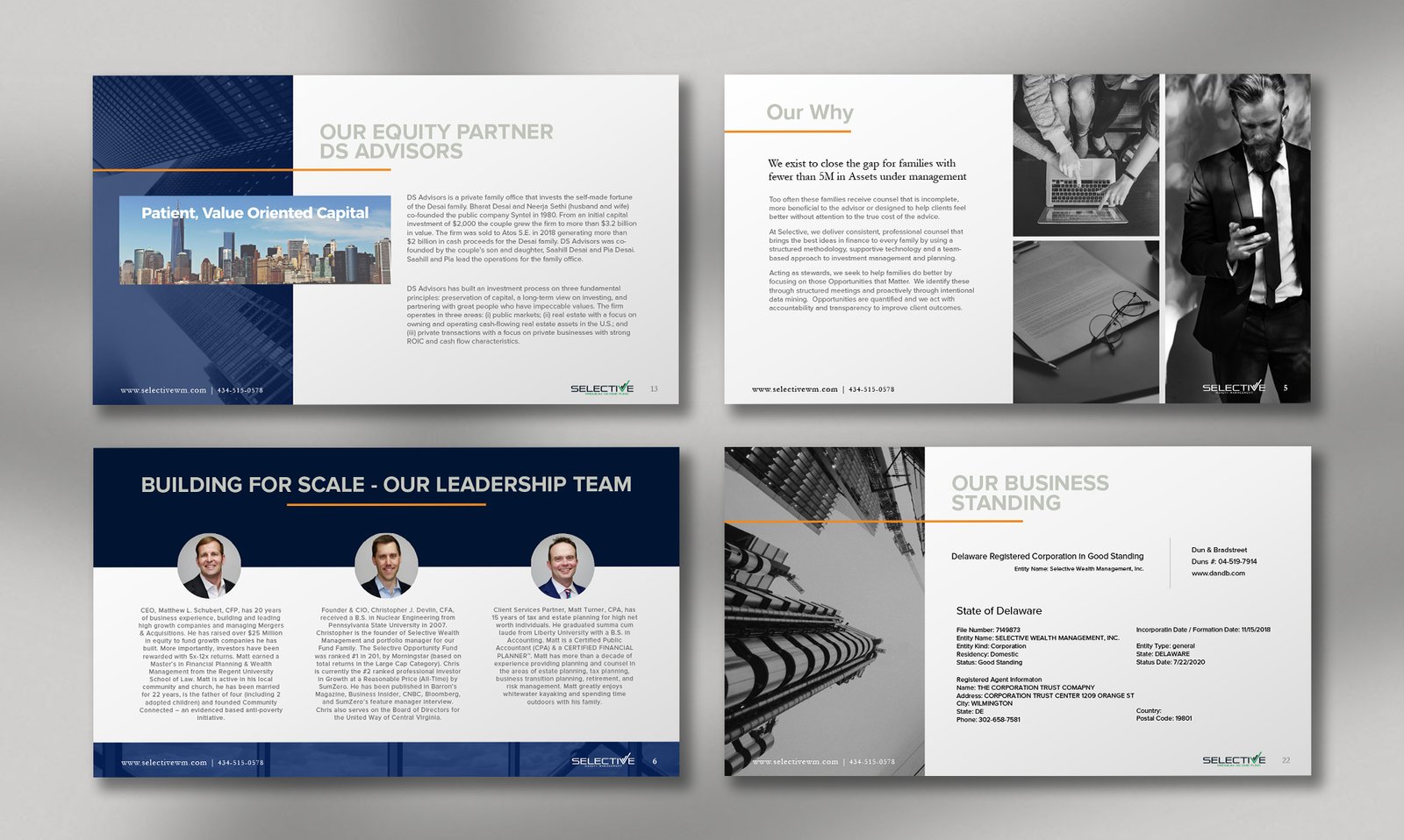
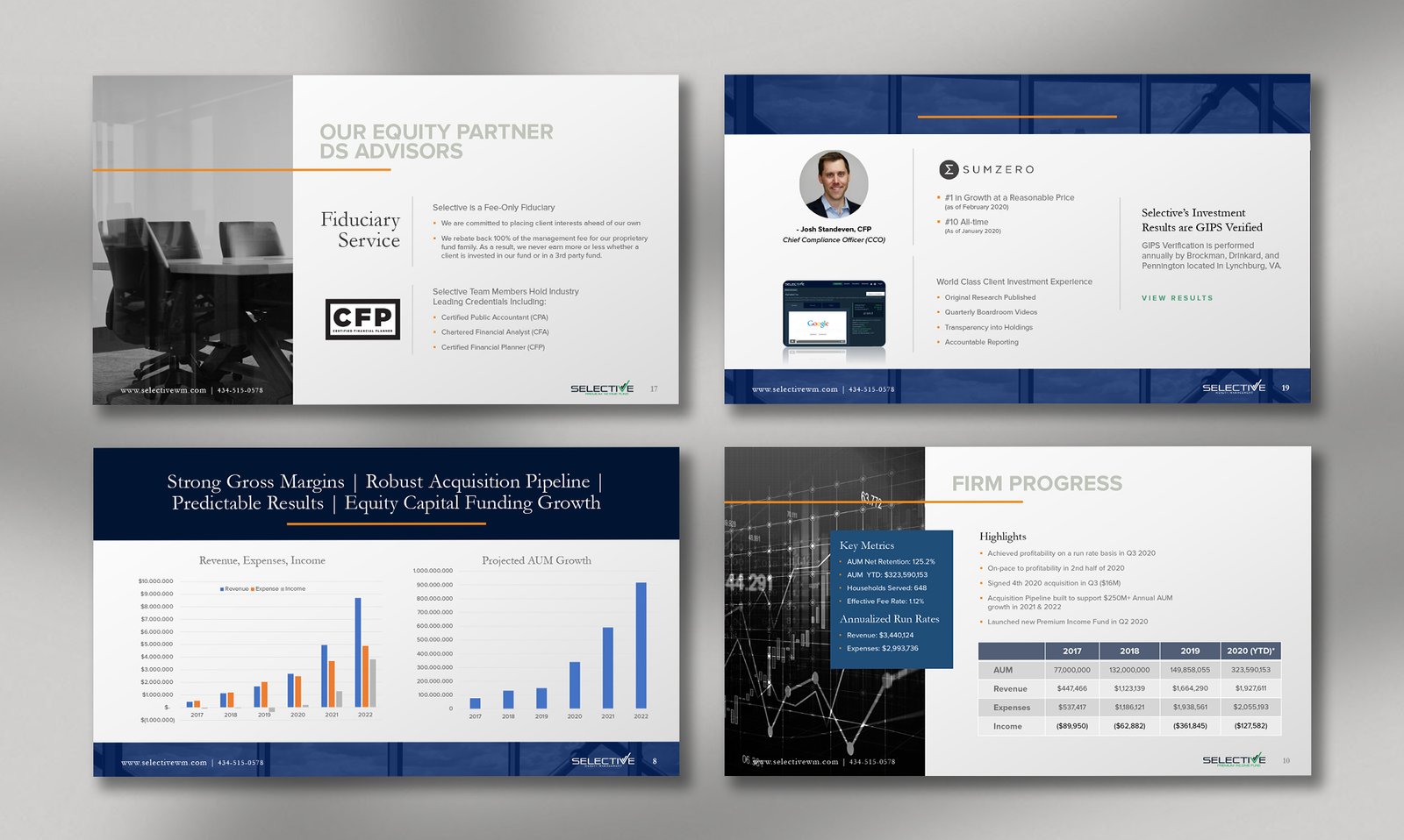
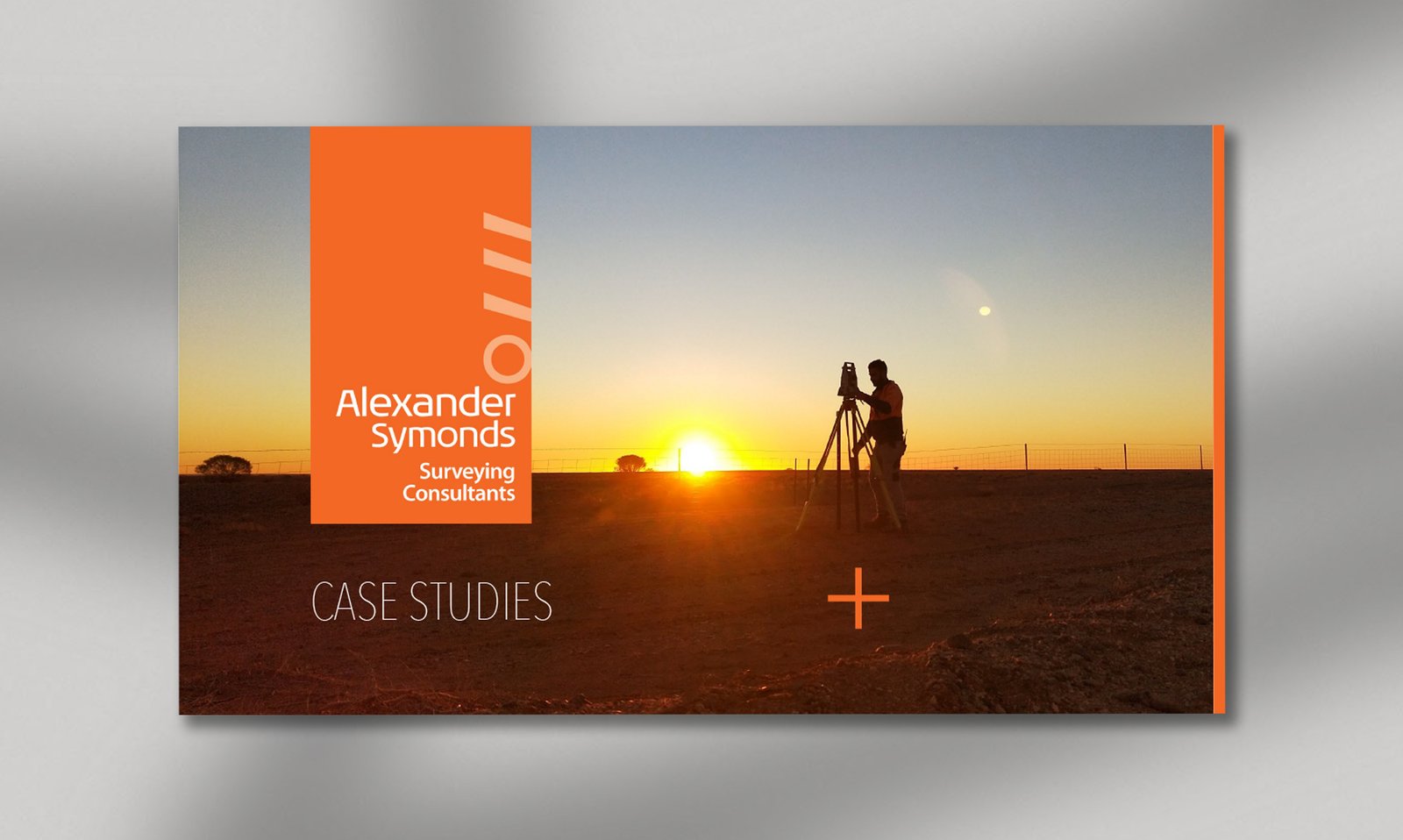
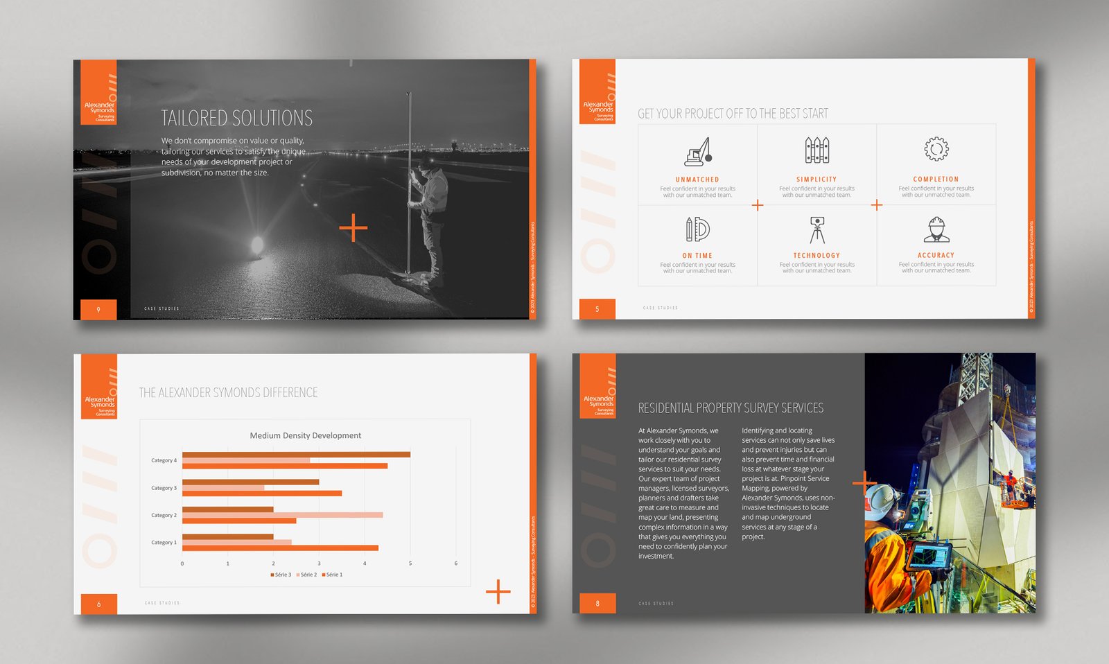
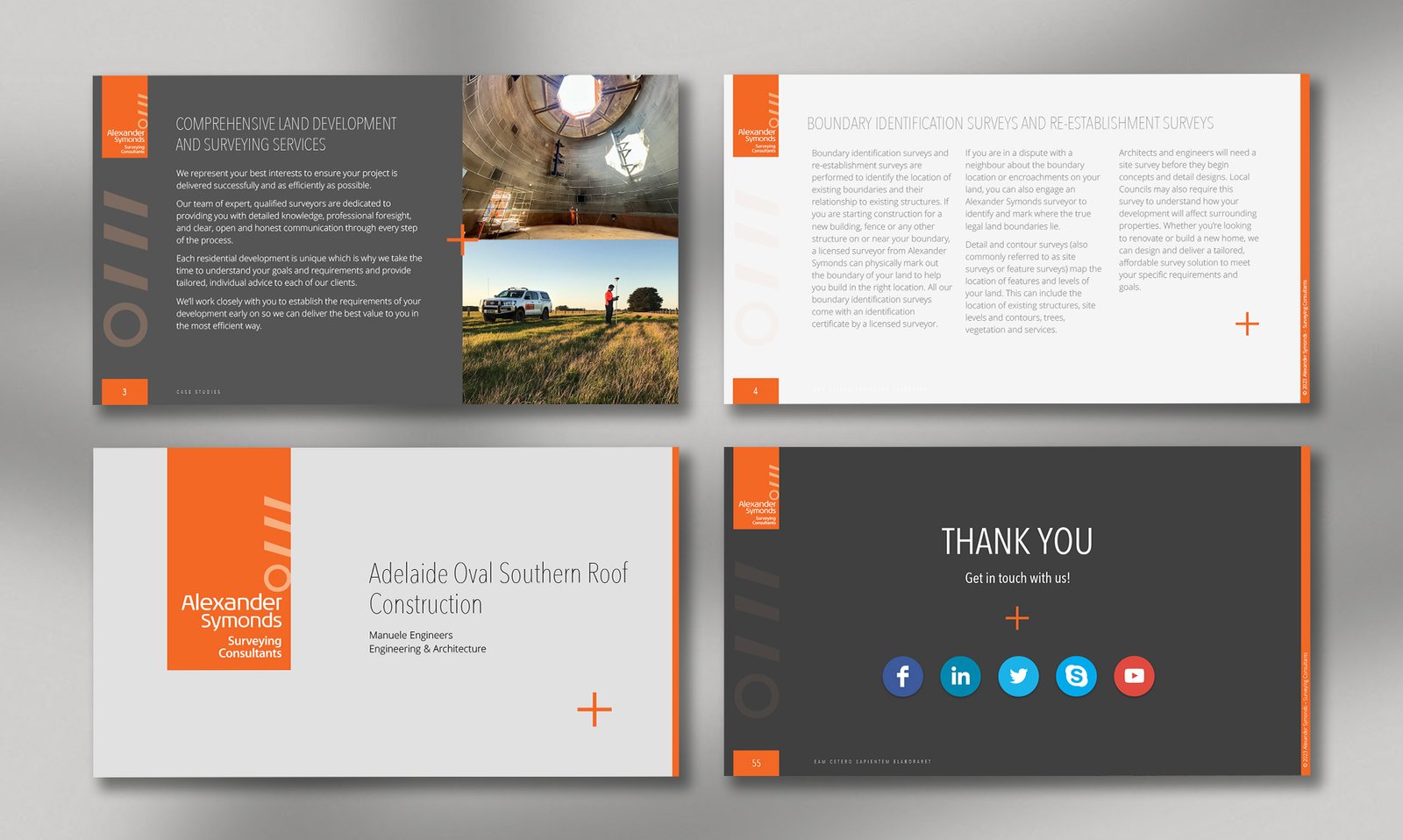
Alexander Symonds needed a PowerPoint system that could bring consistency to presentations without limiting the kinds of information they need to communicate. The design starts with precision: a disciplined grid, consistent alignment, clear typographic hierarchy, and a restrained use of colour create a visual structure where every element has a defined place. The orange accent adds recognition and navigation without disrupting the overall clarity.
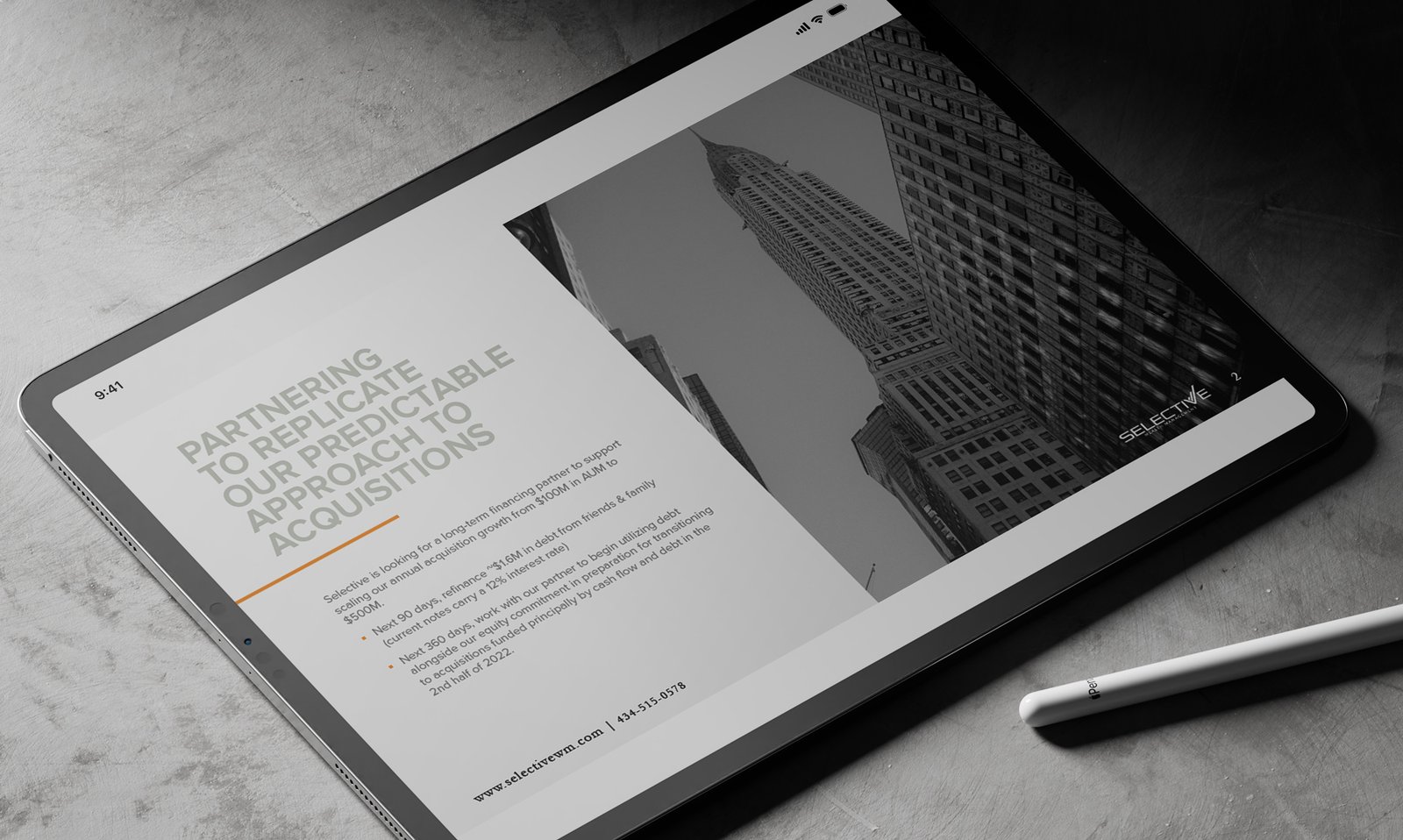
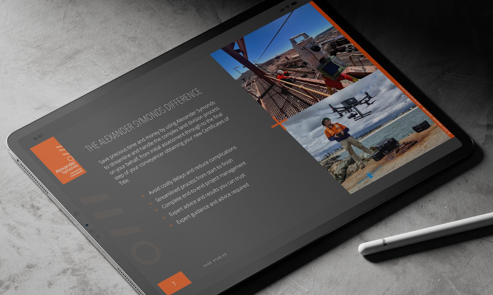
That structure is then made flexible enough to accommodate very different content, from long-form text and photography to charts, tables, diagrams, and section dividers. Rather than designing each format as a separate solution, the template applies the same underlying rules across them, allowing different types of information to feel like part of the same presentation.
What emerges is a system that is precise without becoming rigid. Its value is in the consistency it makes possible across presentations, users, and subjects. The design turns precision into something reusable, giving the template enough structure to stay recognizable while leaving enough freedom for the content to do the work.
CLIENT
Alexander Symonds
PROJECT
PowerPoint Template / Slides Guide
SOFTWARE
Microsoft PowerPoint
Adobe Photoshop