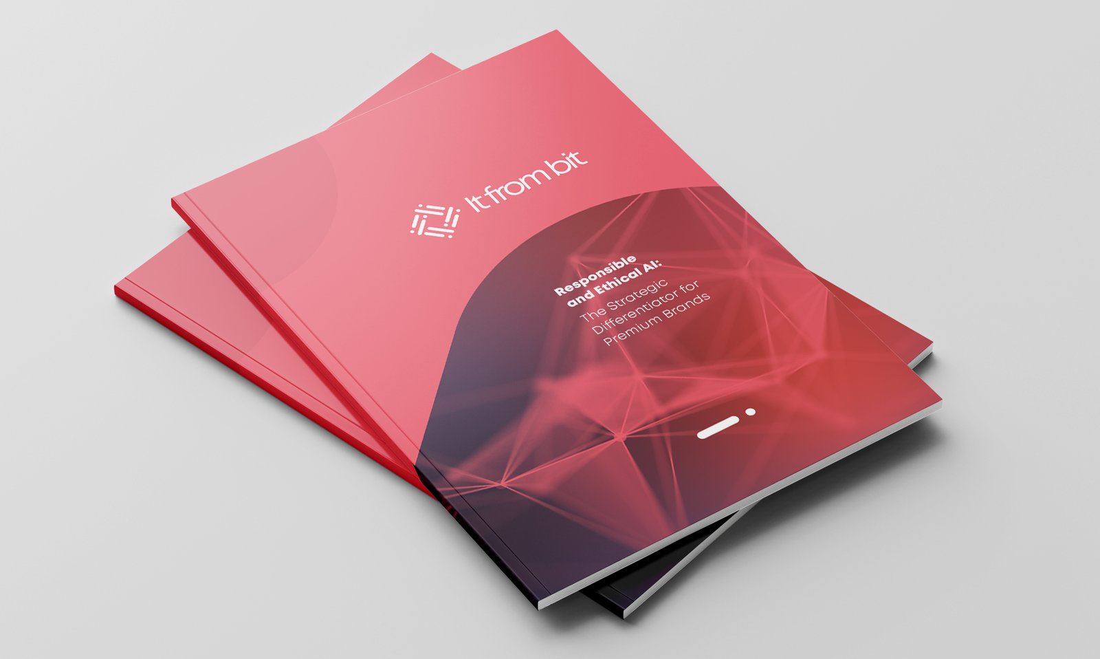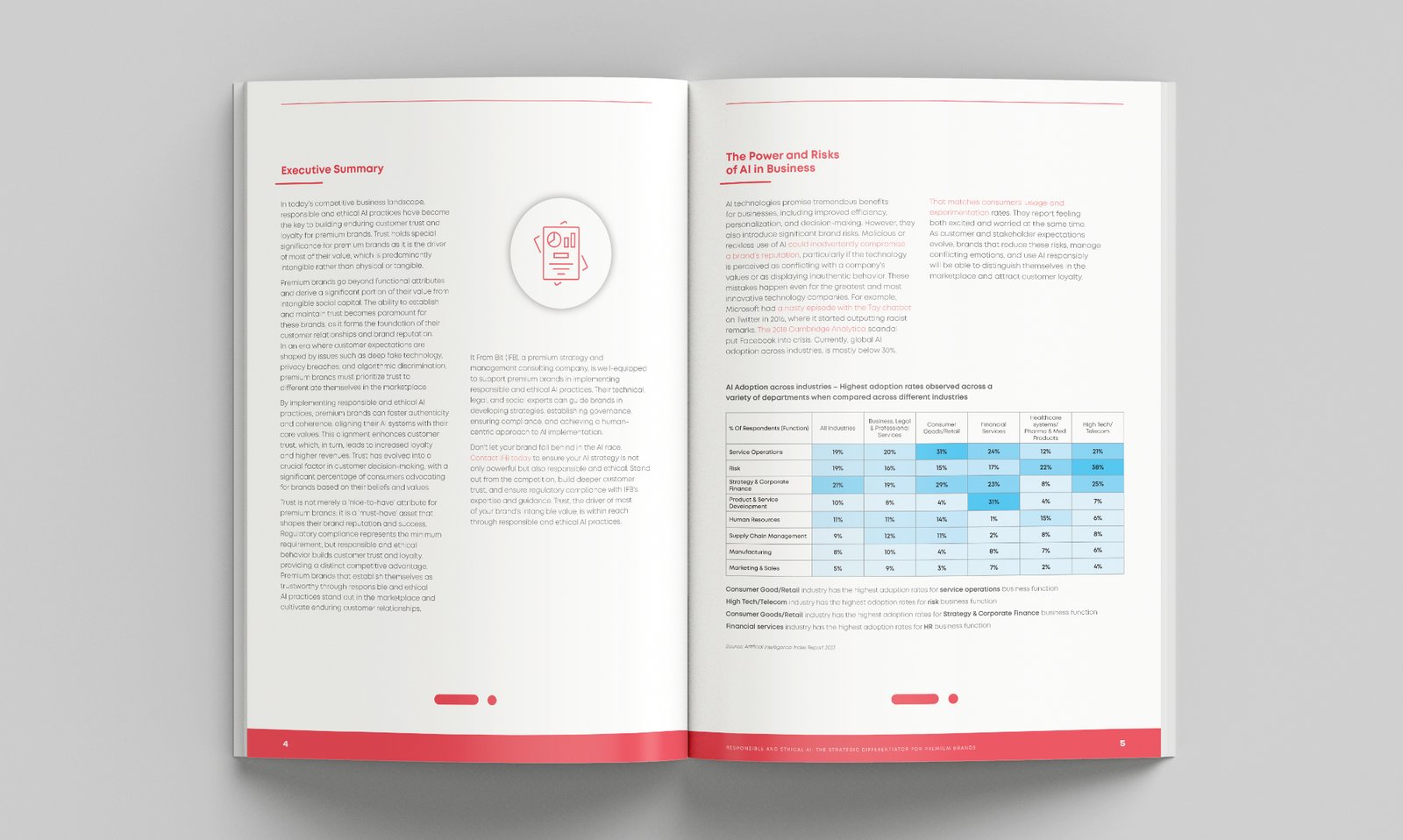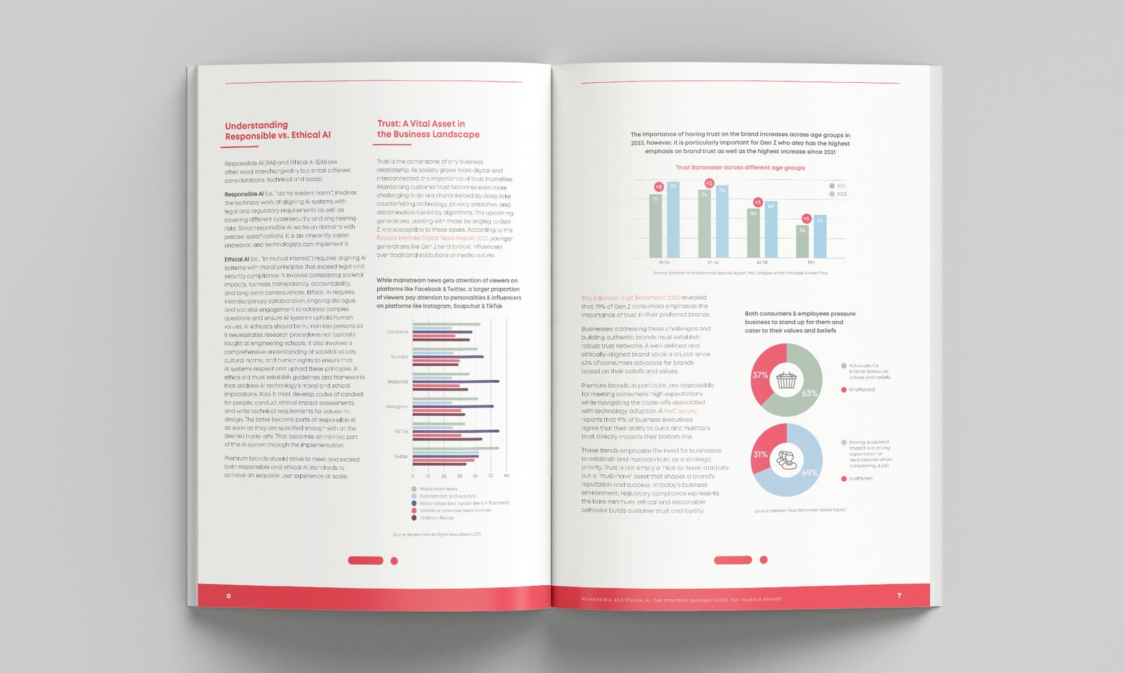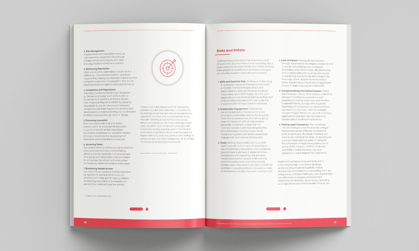
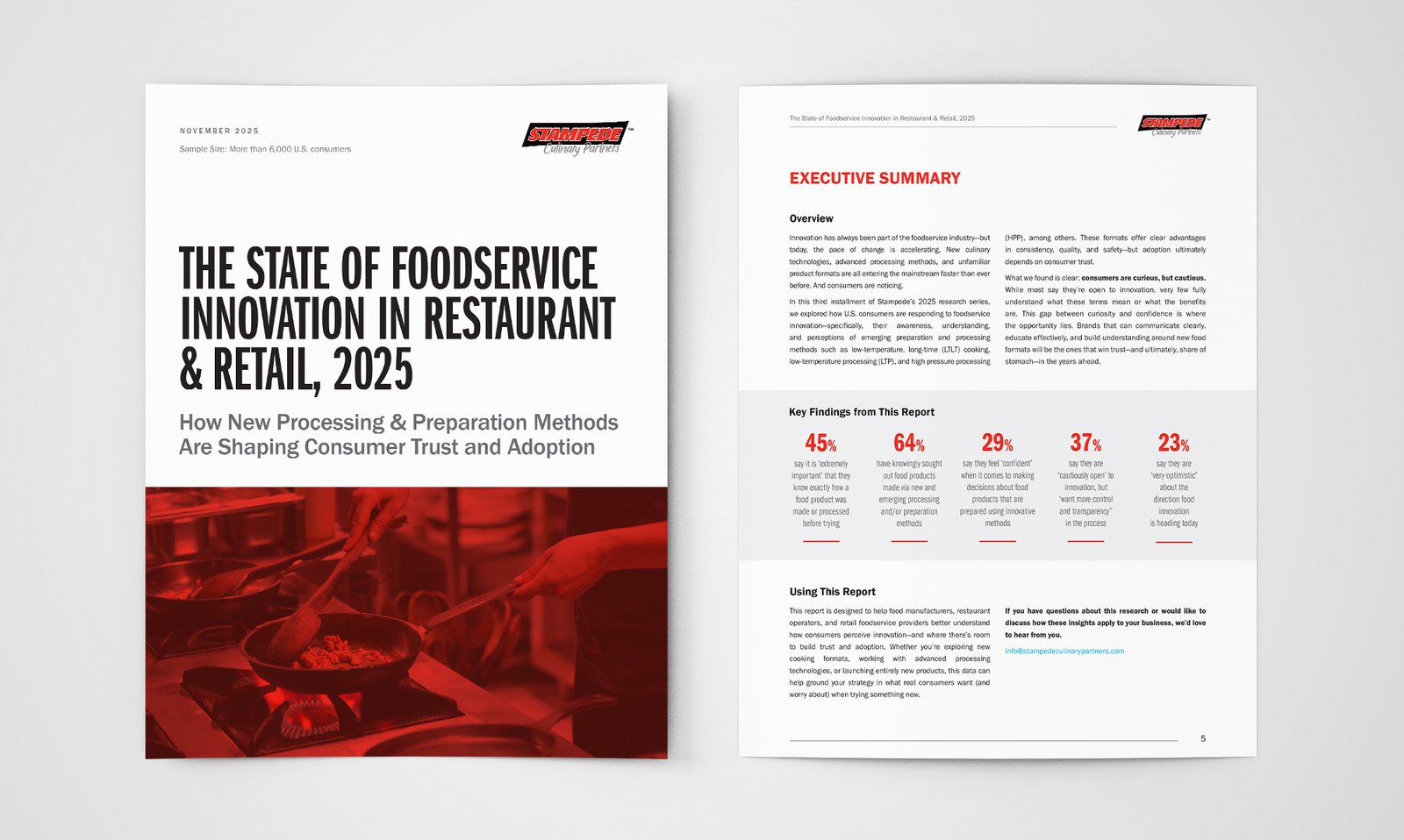
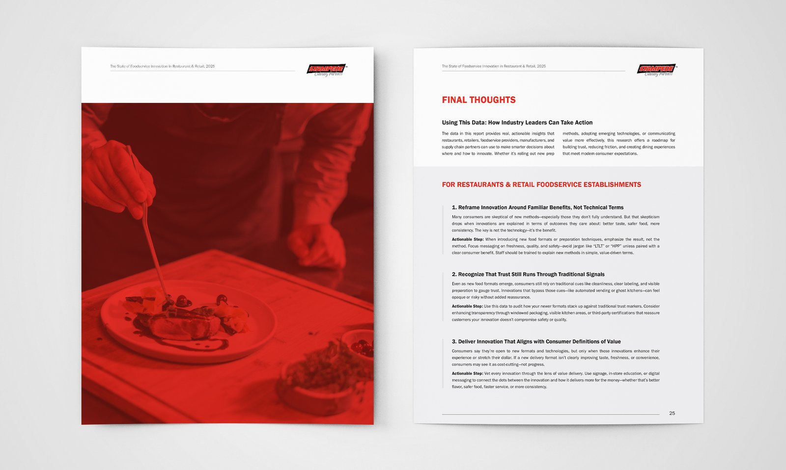
Rather than softening the brand's intensity to suit "research report" conventions, the design leans into it.
Consumer research reports tend to borrow a visual language of neutrality: cool greys, muted blues, restrained type. Stampede's brand runs the opposite way, a bold saturated red with the energy of a livestock brand mark. The challenge was reconciling the two without diluting either.
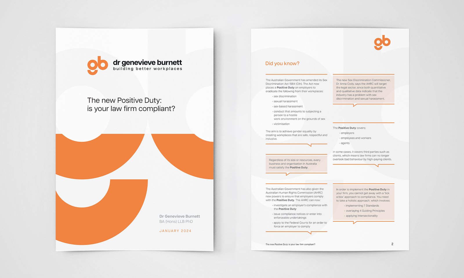
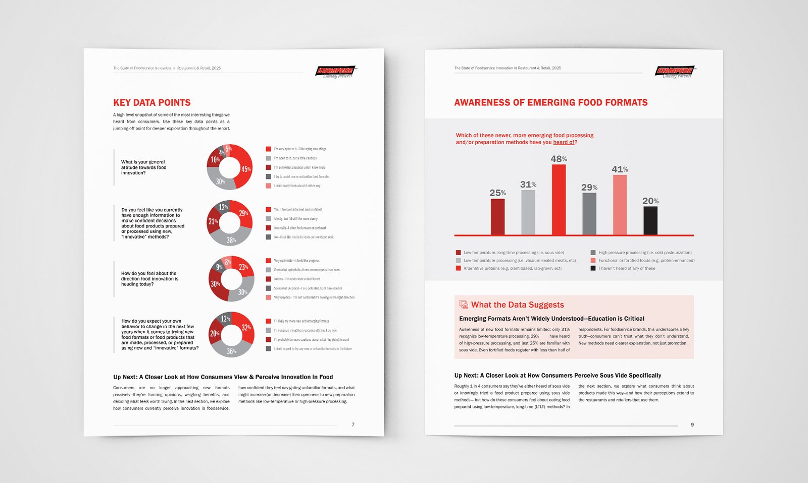
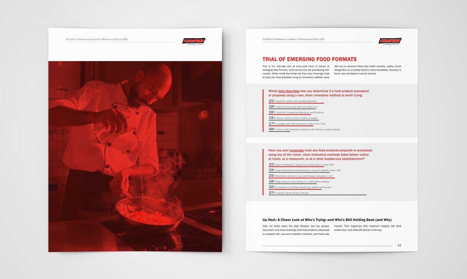
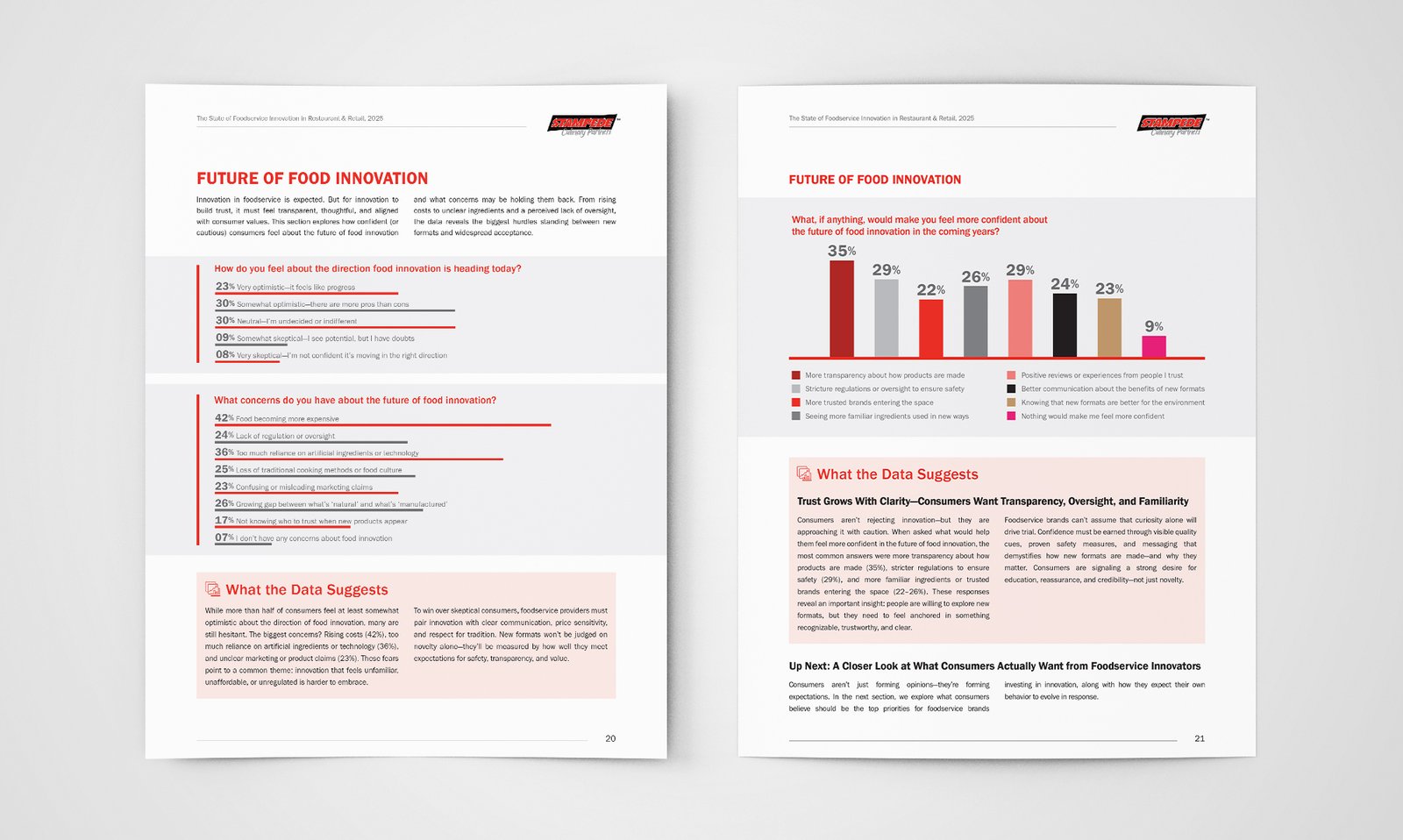
The solution was a consistent duotone treatment: full-bleed kitchen and production photography drenched in red, applied across every section break. Rather than softening the brand's intensity for "research report" conventions, the design leans into it, using red as a structural device that gives a chart-heavy report a strong identity from cover to close.
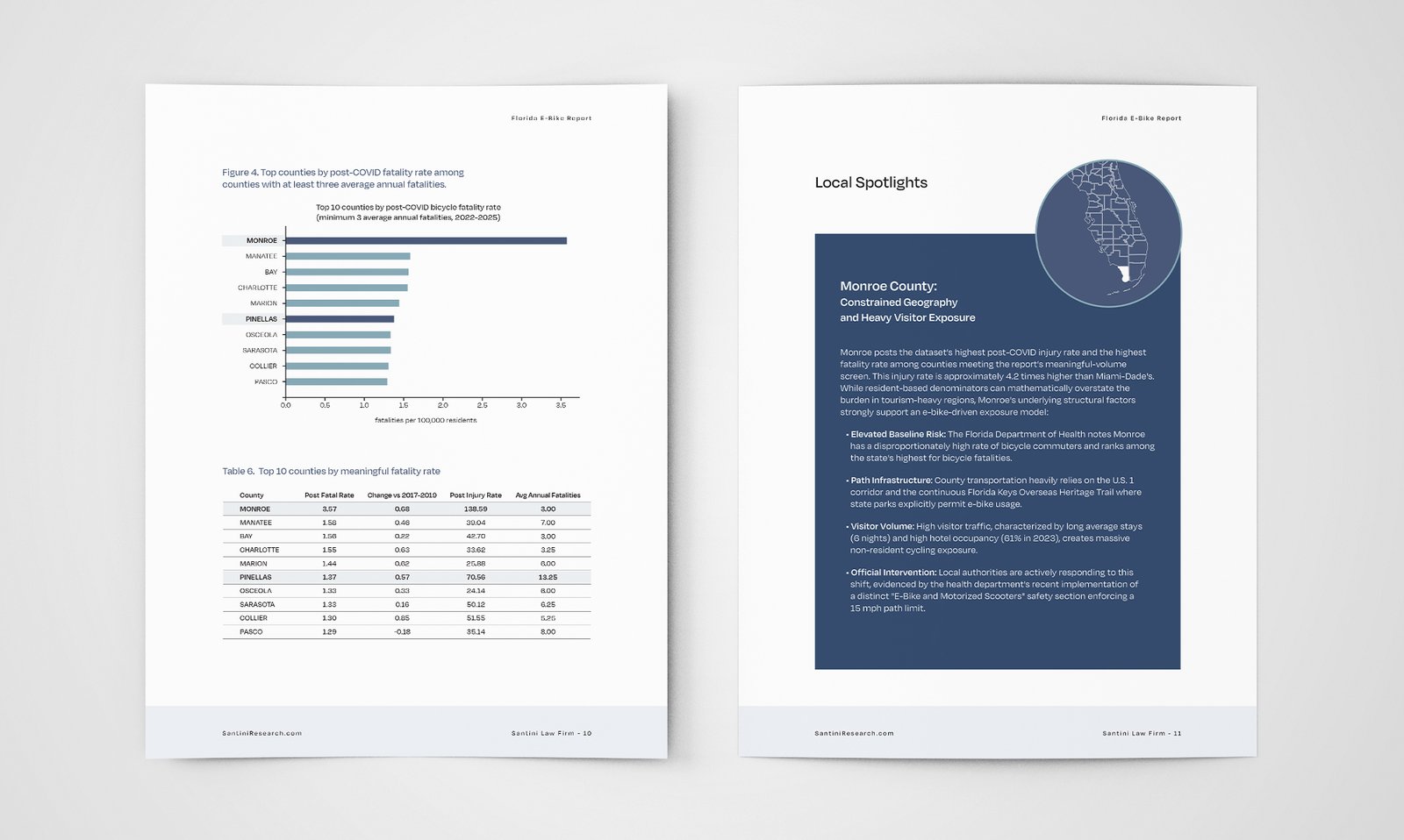
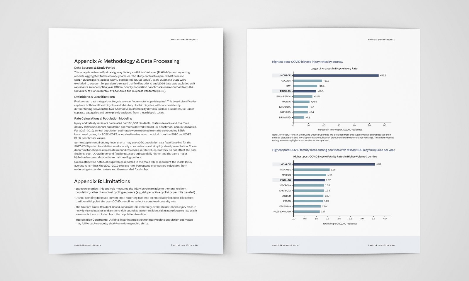
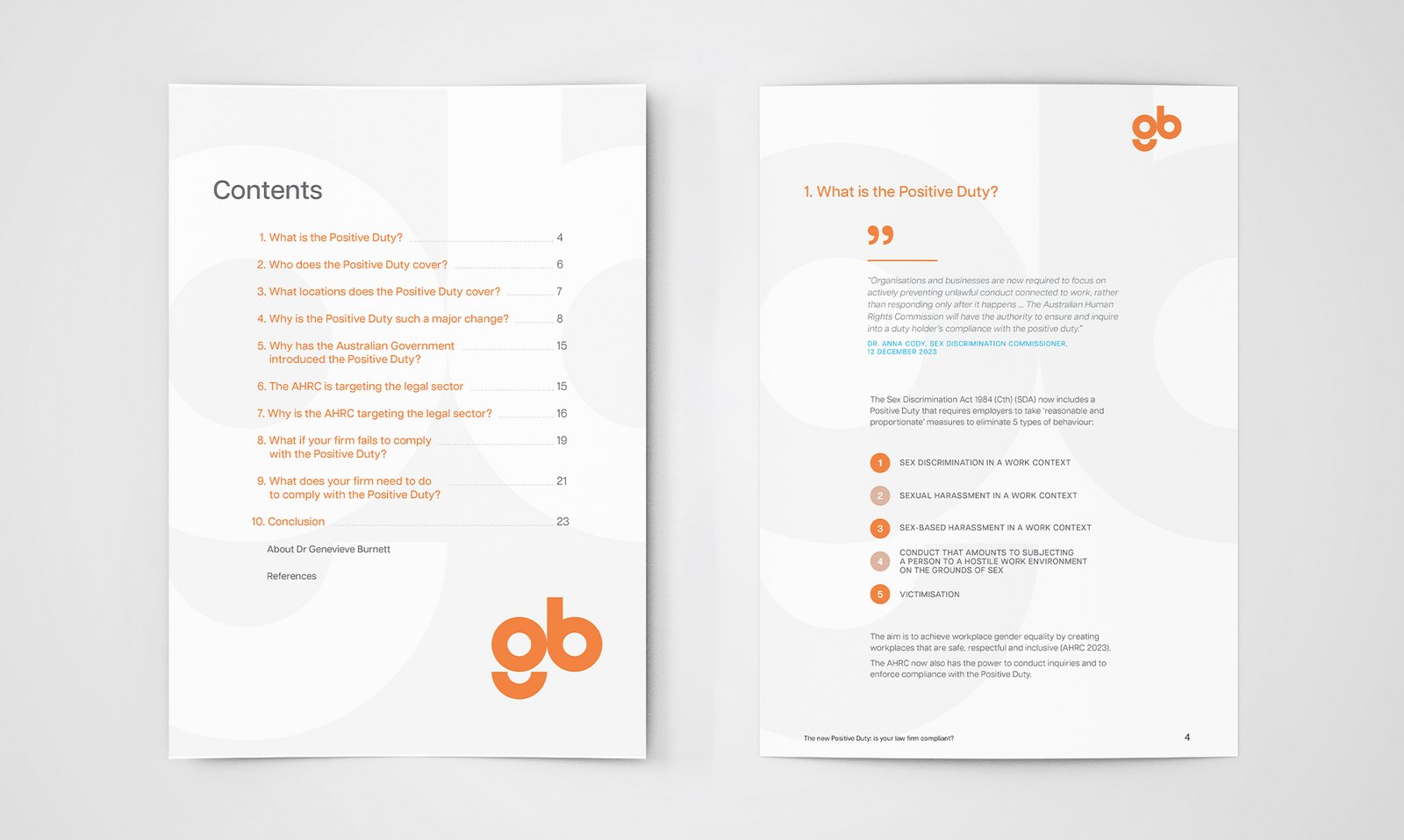
The data stays legible: clean charts, generous whitespace, and a repeating "Up Next" transition that keeps a 27-page report moving like a narrative. The industrial photography grounds abstract survey data in the physical world Stampede operates in.
The result reads as credible research without losing the brand's identity.
CLIENT
Stampede Culinary Partners
PROJECT
The State of Foodservice Innovation in Restaurant & Retail Report, 2025
SOFTWARE
Adobe InDesign
Adobe Acrobat Professional