This report needed something with more weight, motion and momentum, without losing the trust the brand depends on.
Annual letters from investment firms carry a built-in tension: dense content — performance tables, macroeconomic analysis, nine company reviews — that still needs to read as something a client wants to open, not a compliance filing.
As a fee-only fiduciary, Selective's pitch rests on discipline over charisma. The instinct in wealth management branding is warmth — couples on the beach, soft light. This report needed more weight instead.
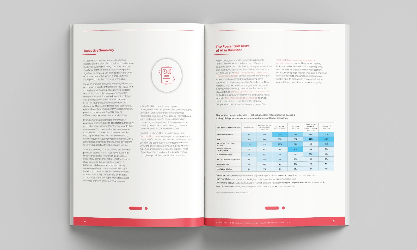
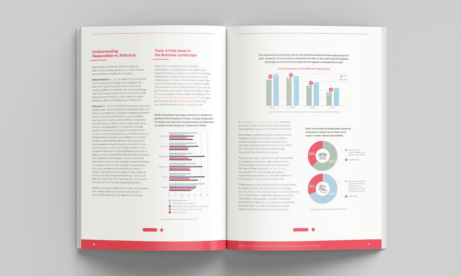
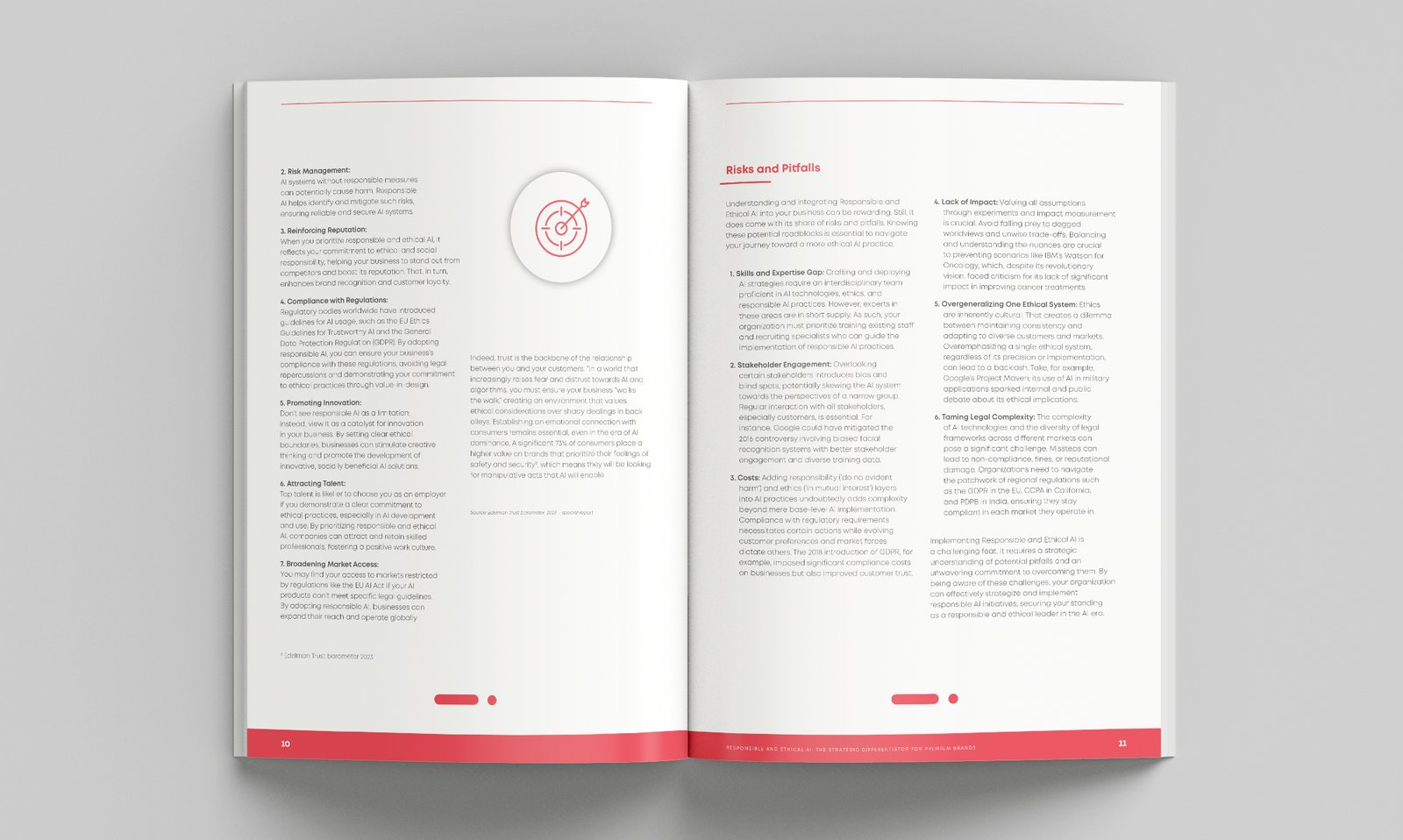
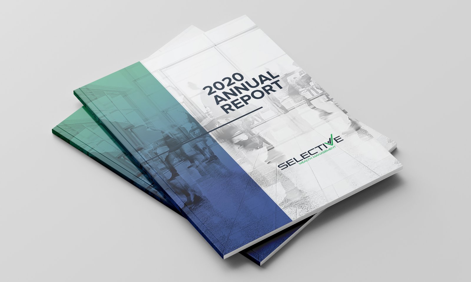
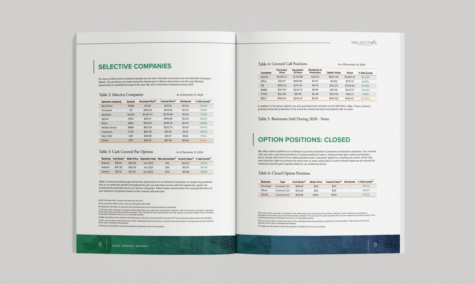
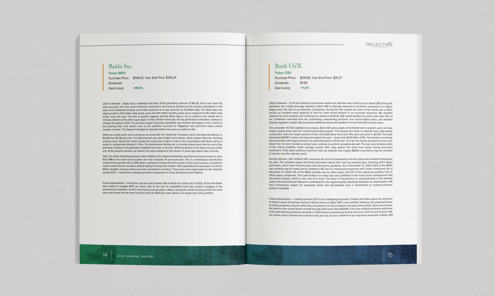
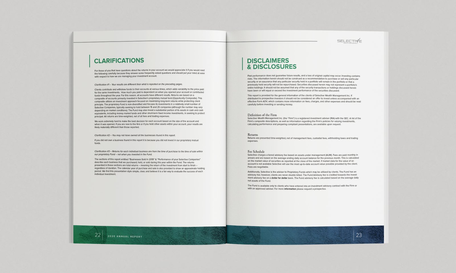
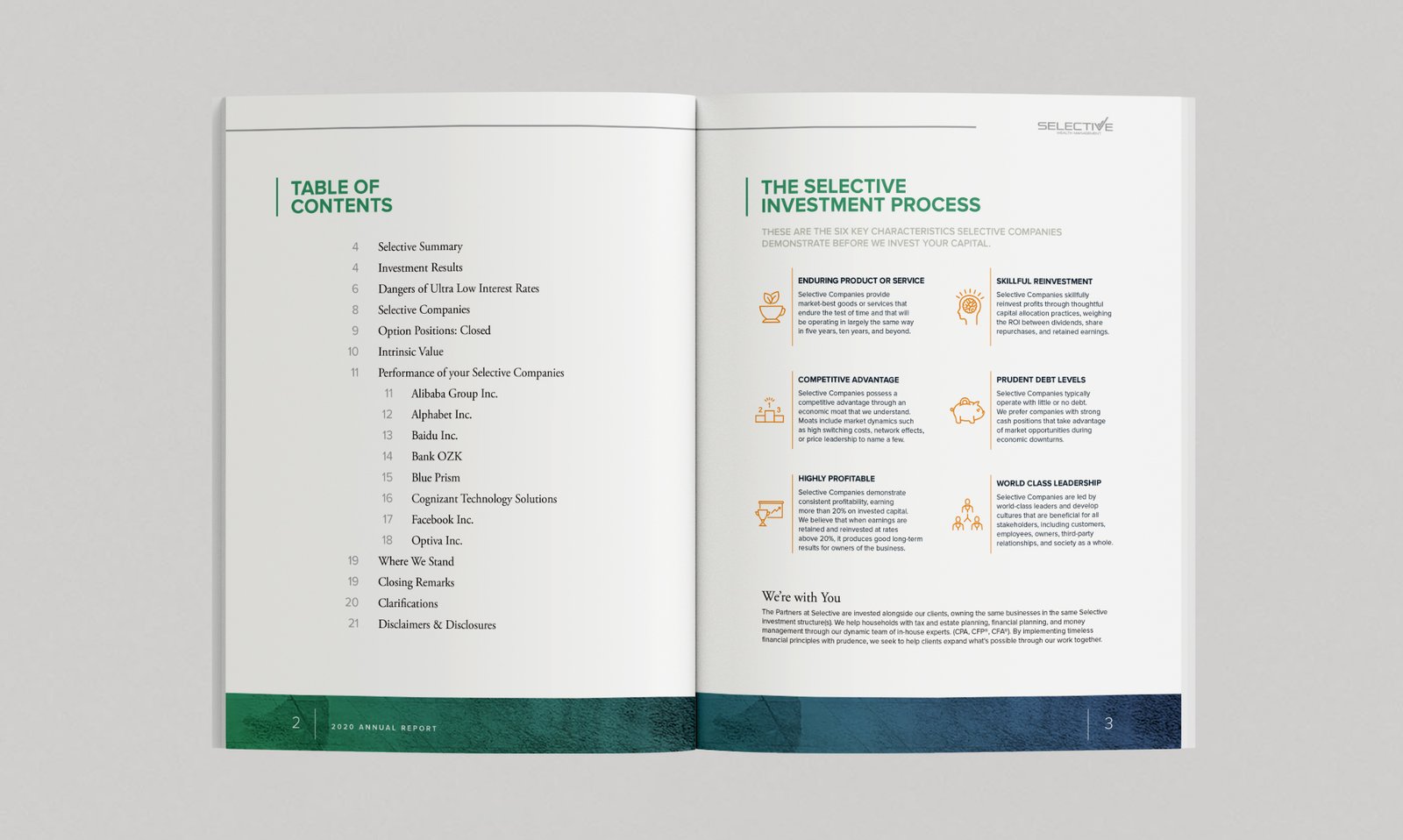
The cover reflects that: a monochrome photograph of people in motion beneath a single vertical gradient from green to blue, echoing the brand without literal imagery of wealth. Inside, a consistent system — green for headers, orange for key data, a repeating footer gradient — gives a dense document rhythm across nine very different businesses.
The result reads as what it claims to be: a straight account from a fiduciary confident enough to let its numbers speak.
CLIENT
Selective Wealth Management
PROJECT
2020 Annual Report
SOFTWARE
Adobe Illustrator
Adobe Photoshop
Adobe Acrobat Professional