


When every product looks a little like the last one, the design can't rely on the photography to tell them apart. The grid has to do it.
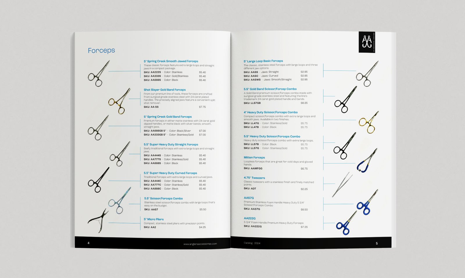
Angler's Accessories needed a catalog that could hold hundreds of small, visually similar products — forceps, nippers, retractors, floatants — without turning into an undifferentiated wall of SKUs.
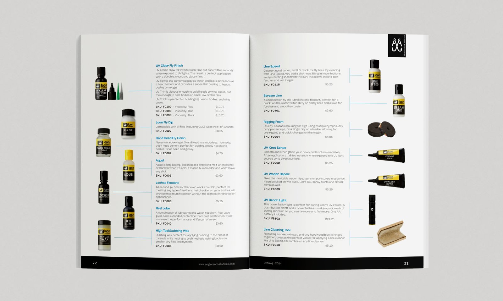
The design solves this with a strict grid: product photography floats left, thin horizontal leader lines run from each item to its name, description, and pricing on the right. That single connective device does the organizing work a busy catalog usually can't afford, letting a page with a dozen near-identical forceps stay scannable rather than overwhelming.
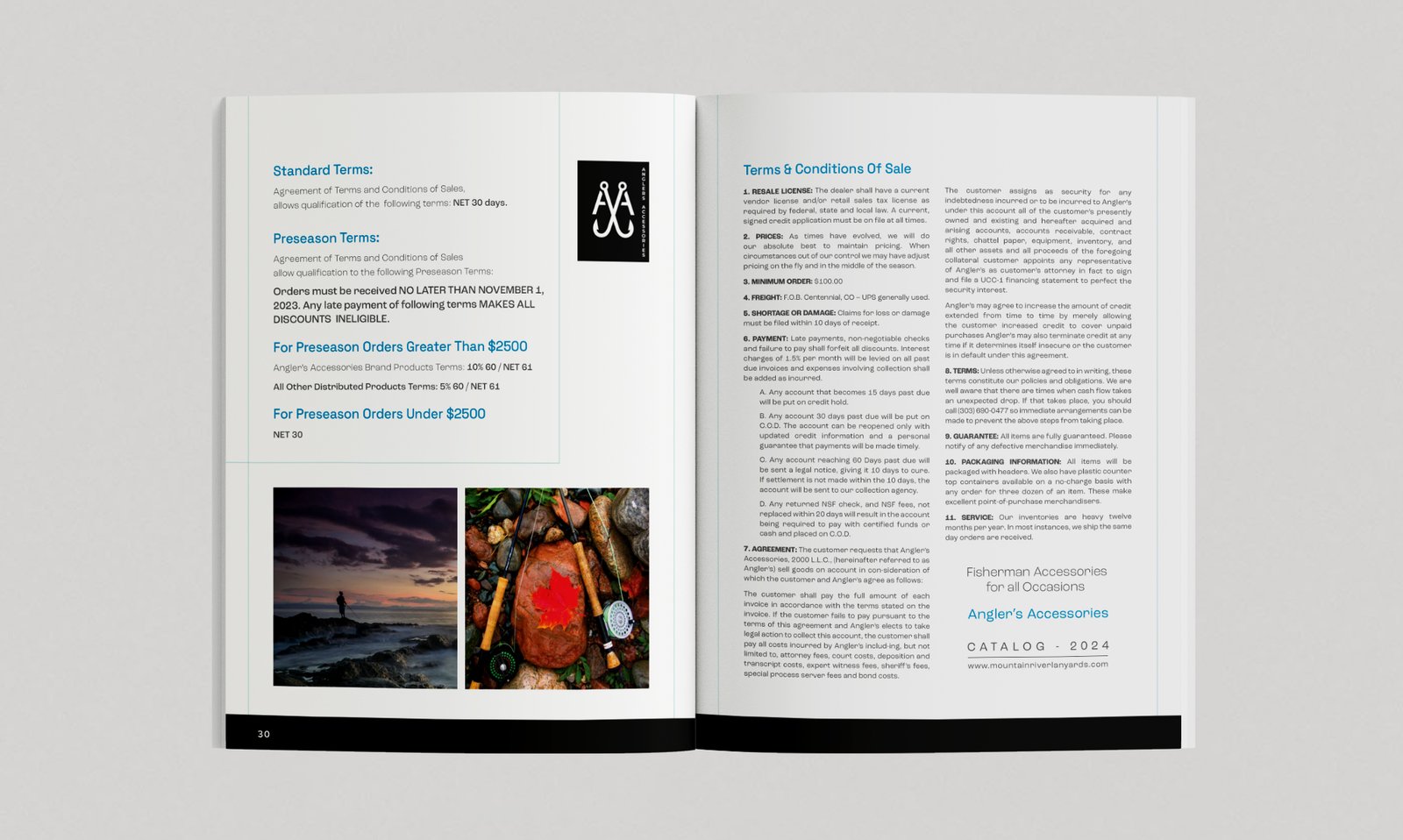
Photography does the emotional work the product pages deliberately skip. Section openers use moody outdoor imagery, while the product spreads switch to flat, evenly lit studio shots on white — with blue as the one consistent accent tying both registers together.
The result reads like a field-tested equipment manual rather than a sales catalog, which is exactly the tone that earns trust with working anglers and shop buyers alike.
CLIENT
Angler's Accessories
PROJECT
B2B Trade Catalog
SOFTWARE
Adobe Illustrator
Adobe Photoshop